
Measure the space where the decal will sit, rather than the full width of the vehicle panel or window. Handles, frames, seams, curved areas and existing markings can make the usable space much smaller. Once that area is clear, scale the artwork to it without stretching the logo.
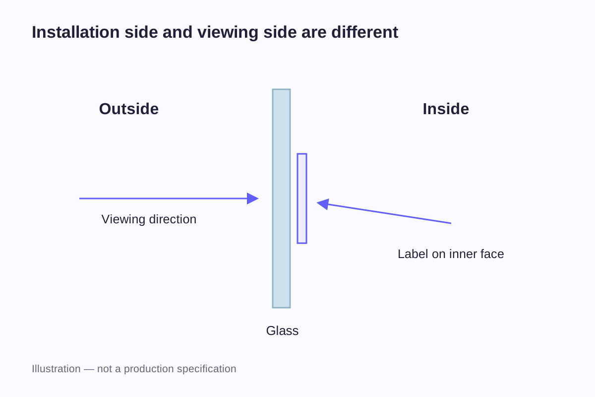
Glass adds a second question: which side receives the decal, and which side should show readable artwork? “Inside window sticker” does not answer both. The dimensions, installation side and viewing side should appear together in the design brief.
Begin with the actual placement
A car door graphic and a window graphic may use similar-looking artwork, but their backgrounds and installation areas differ. A painted panel gives the design a relatively defined background color. A clear window can show a changing scene behind the graphic, as well as reflections on the glass.
Photograph the intended position straight on where practical, then measure directly on the panel or glass. Use the photograph to mark the location, with the measured dimensions written beside it. Perspective can make the top of a panel appear shorter than its bottom or make a curved surface look flat, so do not derive the size from the image alone.
| Placement | Measure first | Mark on the drawing |
|---|---|---|
| Door or body panel | Usable width and height within the intended area | Seams, handle position, trim and prominent curves |
| Window pane | Usable area inside the frame or other boundaries | Installation side, viewing side and existing graphics |
| Small branding panel | The flat or suitably shaped area available to the logo | Nearby fittings, edges and the desired alignment |
| Repeated graphics on several vehicles | The corresponding area on each vehicle | Differences that require separate sizes or layouts |
For a curved panel, distinguish the distance measured along the surface from the apparent width in a photograph. They can differ. A flexible paper mockup helps reveal the shape, but its ability to bend does not establish that a particular vinyl construction will suit the same area.
A fleet can contain several body styles even when the brand identity stays the same. Keep one approved logo master, then develop placement drawings for the areas that actually differ. Copying dimensions from the first vehicle can create an awkward result on the next.
Compare sizes without treating them as vehicle standards
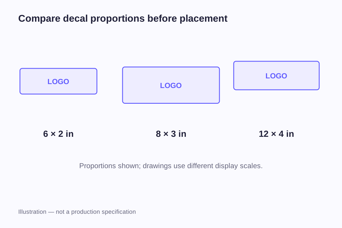
The following dimensions are useful for comparing physical scale and aspect ratio. They are not recommended sizes for a particular vehicle model or window.
| Example decal size | Equivalent dimensions | Width-to-height ratio |
|---|---|---|
| 6 × 2 inches | 152.4 × 50.8 mm | 3:1 |
| 8 × 3 inches | 203.2 × 76.2 mm | 8:3 |
| 12 × 4 inches | 304.8 × 101.6 mm | 3:1 |
| 200 × 100 mm | Approximately 7.87 × 3.94 inches | 2:1 |
| 300 × 150 mm | Approximately 11.81 × 5.91 inches | 2:1 |
A 6 × 2 inch design can be enlarged proportionally to 12 × 4 inches because both use a 3:1 ratio. Enlarging it to 8 × 3 inches changes that ratio. The artwork would need to fit within the new rectangle, gain surrounding space or be rearranged; stretching it to fill the rectangle changes the shape of the lettering and logo.
For a custom outline, record maximum finished width and height. The printed logo may occupy less area than that outside envelope. A circular badge needs a diameter, while a long wordmark needs both dimensions. The general sticker size guide explains these measurement conventions in more detail.
A panel layout example
Suppose a measured area is 360 × 180 mm. In this example, the design reserves 20 mm at each side and 15 mm at the top and bottom:
Available design width = 360 − 20 − 20 = 320 mm
Available design height = 180 − 15 − 15 = 150 mm
A 2:1 logo can fit at 300 × 150 mm. It uses the full available height and leaves 20 mm of unused width inside the design area. If centered, the logo sits 30 mm from each original side boundary: the planned 20 mm reserve plus another 10 mm.
A 320 × 160 mm version would preserve the logo's proportions but exceed the available height. Reducing its height alone to 150 mm would distort it. The sensible choices are a smaller proportional logo or a different arrangement of the logo and supporting text.
These reserves are assumptions for the worked example. The actual drawing needs to reflect the panel's features and the proposed material, rather than adopting 20 mm or 15 mm as a general installation rule.
Separate the logo size from the message layout
A business name, emblem, web address and short description do not need equal visual weight. Give the main identifier the space it needs, then decide which supporting information belongs in the remaining area.
A compact logo with one short line can remain coherent when reduced. Adding three extra lines may force all the lettering smaller, even though the overall decal becomes larger. In that case, the problem is the information layout rather than the outside dimensions.
Compare two versions at their intended size. In one, keep the logo large and place a short line beneath it. In the other, arrange a smaller logo beside the wording. Judge the spacing and the shape of the complete group before choosing its outside outline.
Viewing distance is part of that judgment, but it does not supply a universal size formula. Typeface, letter spacing, contrast, background and lighting all influence what someone can read. A fixed “one inch of letter height equals a particular distance” rule would conceal those differences. Position a full-size mockup and view it from the actual locations where the message is intended to be seen.
Mark the installation side and viewing side
For a window design, identify where the adhesive will contact the glass and where the viewer will stand. These choices affect the image orientation and how the print layers are arranged.
| Installation | Intended viewing | Design information to communicate |
|---|---|---|
| Outside of glass | From outside | Artwork should read correctly from the installation side |
| Inside of glass | From outside | Artwork must read correctly through the glass and the chosen construction |
| Inside of glass | From inside | Artwork should read correctly from the interior viewing position |
| Either side | Readable from both sides | A separate two-sided requirement, including orientation and appearance on each side |
For inside installation with outside viewing, a production arrangement may require mirrored artwork. That instruction is not enough by itself: the material, adhesive position and print layers also need to support the intended view. Mirroring a file does not make an opaque decal readable through its back.
Send the normal-reading artwork and a clear description of the intended view. Label any mirrored file explicitly so it is not reversed again by mistake. A small diagram with a glass line, an installation arrow and a viewer arrow is often the clearest way to express the requirement.
Roland's transparent-object printing guide illustrates the distinction between viewing a printed surface directly and viewing from the opposite side. It also shows the role of white ink beneath color. This explains a printing principle; it does not establish a white-ink or two-sided production option for every decal order.
Background and material change the visible result
The same colored artwork can look different on a white vehicle, a dark panel and clear glass. A printed background within the decal can give the logo a more consistent setting, while a transparent surround allows more of the panel or glass to remain visible.
On a window, the background can change between a bright exterior scene and a darker interior. Reflections add another visual layer. Fine wording that looks clear in a white artwork window may be much harder to distinguish in that setting.
The clear-versus-white sticker guide compares transparent areas, opaque backgrounds and white printing layers. It helps separate the appearance you want from the production method needed to create it.
Tell the supplier whether the decal will go on paint, another coating or bare glass, and describe the surface condition, cleaning and weather exposure. The term “vehicle vinyl” does not give an outdoor lifespan or a removal guarantee. Lamination may be part of the finished decal, but the base film and adhesive still need to suit where it will be applied.
Avery Dennison's vehicle graphics guidance directs installers to the particular film's data for substrates, application temperatures and service conditions. It also addresses surface and paint condition. Use those requirements only for the film they describe; they are not installation settings or performance claims for other vinyl.
If moisture or cleaning exposure is part of the brief, the waterproof and water-resistant sticker guide explains which conditions need to be described. For a required period of outdoor use, include the location, weather exposure and cleaning routine so they can be compared with material data or test results for the proposed film.
Make a paper mockup at the correct scale
Print the proposed outside shape and artwork at 100% scale, with automatic page fitting switched off. Add a calibration line, such as 100 mm, and measure it on the print. A document labeled “actual size” can still be reduced by a print setting.
If the mockup spans several sheets, align matching reference marks before assessing it. Measure the assembled width and height rather than adding the nominal paper widths. Printer margins can otherwise create an unnoticed gap or overlap.
Hold or temporarily position the mockup in the intended area using a method appropriate for the surface. Look at the whole group of artwork, not just whether its outside rectangle fits. Examine alignment with nearby features, the relative size of the logo and wording, and the amount of empty space around them.
For an inside-mounted window design, assess it from the intended viewing side. Ordinary paper cannot demonstrate the transparency or ink-layer effect of a finished decal, but it can reveal a size or orientation problem before sampling.
Record the selected placement with measurements from identifiable points, such as the panel edge or window frame. A picture of a floating paper logo is less useful for repeat orders than a drawing that states where its center or edges belong.
Small decals and full vehicle wraps
A small logo on a defined panel and a multi-panel wrap are different design and installation tasks. A wrap can involve large joined graphics, complex curves and a film system selected for that work. Its installation allowances should not become the default border or bleed for a small decal.
Keep the brief focused on the graphic being ordered. If the artwork crosses several panels, follows a deep contour or needs multiple pieces aligned, describe that scope explicitly and involve the intended installer. Do not assume that scaling a small sticker up creates a complete wrap specification.
For custom car and window decals, send the artwork, a placement drawing with dimensions, the quantity and a description of how the graphic will be used. For glass, label the installation and viewing sides on the drawing. Identify the paint, coating or glass that the adhesive will touch, along with the required finish.
For several designs, identify the quantity of each. For several vehicle types, identify which drawing belongs to which placement. This avoids a single “large decal” description being used for different physical requirements.
Frequently asked questions
There is no single dimension that fits every vehicle and design. Measure the usable area of the actual window and decide how the graphic should sit within it. The window's outermost width may be larger than the space available at the height where the decal will be placed.
If it must read from the opposite side, the print arrangement generally needs to account for that reversed view. Identify both sides and supply clearly labeled artwork. The material and layer arrangement matter as well, so mirroring the file alone does not define the finished construction.
The dimensions can be the same if they suit both measured areas, but the surface and viewing requirements may differ. A panel design seen directly and a window graphic seen through glass should be specified separately even when they share the same logo and outside size.
It increases the physical size of the artwork, but contrast, letter shapes and information density still matter. A busy design can remain difficult to read when enlarged. Compare full-size versions with simpler wording or a clearer hierarchy instead of judging only the outside width.
No. It is useful for scale, positioning and orientation. It does not reproduce vinyl adhesion, transparency, surface finish or exposure performance. A physical sample and the proposed material information address those different questions.
Related guides
- Sticker Size Guide: Dimensions in Inches and Millimeters
- Clear vs White Stickers: How Backgrounds and White Ink Change the Design
- Waterproof vs Water-Resistant Stickers: What to Look For
Send a photo with usable width and height, your artwork and the intended quantity. For glass, identify both the installation side and the side from which the design should be read.
Discuss Your Decal