
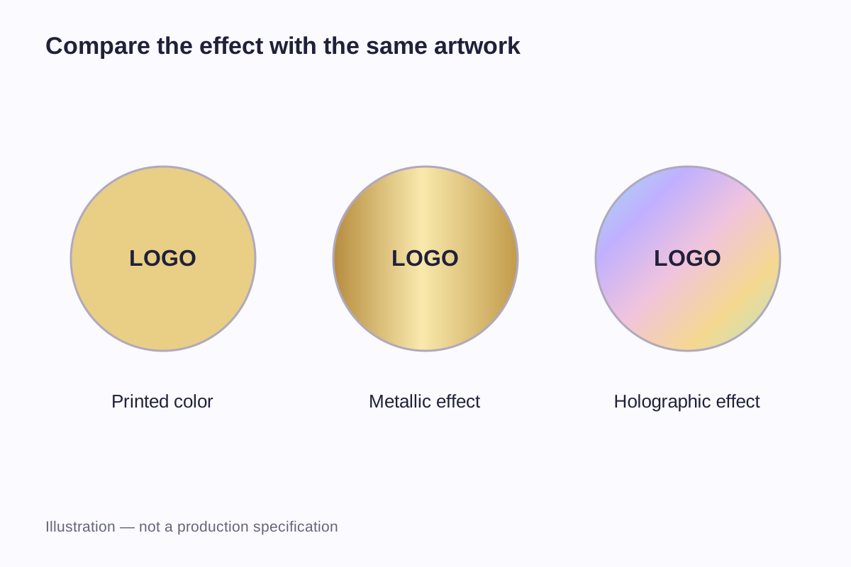
A holographic sticker changes appearance as it moves under light. A metallic foil detail can give a logo a reflective gold or silver finish without turning the whole label into a rainbow. The two effects can overlap: foil can also carry a holographic pattern.
Start with where you want the reflection. Should the entire background catch the light, or only a small emblem? Must the brand name read clearly from several angles? Should the package look metallic, colorful or mostly printed with a restrained reflective accent?
Separate the appearance from the manufacturing method
“Holographic” commonly describes the shifting optical appearance buyers notice. “Foil” can describe a decorative material or a transferred finish. A quote that says only “foil sticker” leaves room for different interpretations: a metallic background, a small transferred logo or a holographic transferred pattern.
KURZ's diffractive hot-stamping range includes holographic and apparent depth effects applied by hot stamping. It is a direct example of the overlap: a finish can be both holographic in appearance and foil-transferred in production. The apparent depth is an optical effect, so it should not be confused with a physically raised resin dome.
| Term in a brief | What it tells the designer | What still needs to be described |
|---|---|---|
| Holographic background | An angle-dependent optical effect is central to the design | Pattern, exposed area and how printed content sits over it |
| Metallic gold or silver | A metal-like reflective appearance is wanted | Whether it covers a background or selected details |
| Foil logo | A particular artwork area receives a decorative finish | The exact finish, artwork boundary and production method |
| Holographic foil | A transferred or foil-based finish has a holographic effect | Color behavior, pattern scale and location |
| Printed gold-colored artwork | The design uses a gold-like color | Whether a reflective finish is also required |
A reference sample is more informative than a name such as “silver hologram.” Two samples described that way can have different patterns and different amounts of exposed reflection. A photograph helps communicate the layout, but a still image captures only one combination of light and angle.
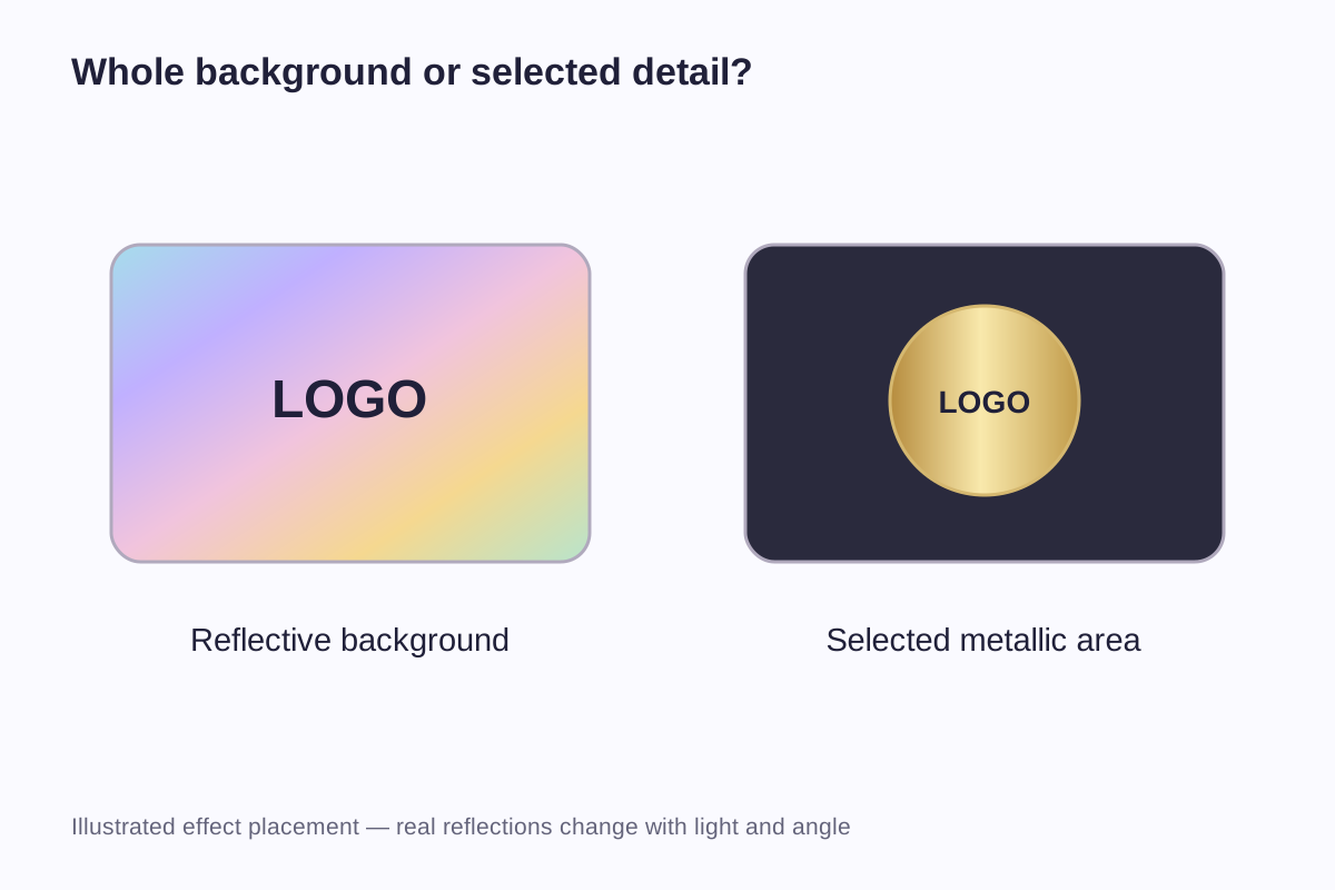
A reflective background or a small metallic accent
A broad reflective background creates a different visual balance from a small metallic accent. If almost the whole sticker reflects, the printed elements have to share attention with it. If only a narrow emblem reflects, the surrounding print can remain the main reading area.
Imagine a black wordmark on a colorful holographic field. The appeal is the movement around the wordmark. Now imagine the same wordmark printed on a calm, light panel with a small gold symbol above it. The foil becomes punctuation rather than the setting for every letter.
Neither arrangement is inherently more expensive-looking or easier to read. The proportion of the finish, the artwork and the packaging around it produce the result. A dramatic background may suit a giveaway badge, while a label carrying a product name and several short instructions has a different job.
The physical outline is another independent choice. A round label, a rectangle and a custom silhouette can all use reflective finishes. Die-cut versus kiss-cut structure determines how the label and backing are presented; it does not determine whether the finish will be metallic or holographic.
A 50 mm round logo in three versions
Consider a fictional brand badge with a central symbol, its name and a short line of text beneath. The finished diameter is 50 mm. For this comparison, a 4 mm outer ring leaves an inner design circle with a diameter of:
50 − 4 − 4 = 42 mm
That 4 mm ring is a design decision for the example. It is not a required production margin, and its relationship to the cut edge would need to be represented in the artwork.
| Version | Treatment of the outer ring | Treatment of the central content | Main question the sample answers |
|---|---|---|---|
| A: holographic background | Exposed holographic effect | Printed symbol and lettering | Does the moving background compete with the small text? |
| B: selected metallic detail | Ordinary printed background | Gold-colored foil effect assigned to the symbol | Is the symbol prominent enough without making every element reflective? |
| C: printed reference | Ordinary printed background | Printed symbol and lettering without a reflective finish | Which differences come from the finish rather than the layout? |
Keeping all three versions at 50 mm matters. A larger holographic mock-up beside a smaller printed label makes the effect difficult to judge fairly. Using the same brand name and line breaks also prevents copy changes from disguising a readability problem.
The ring is not necessarily wasted space. In version A it can show the optical effect while the central area carries the message. In version B, reducing the amount of foil can give the symbol a distinct role. Version C establishes whether the basic design works before reflection enters the comparison.
If the small line is unreadable in all three versions, changing foil is unlikely to solve the main issue. The text may need more room, a different weight or fewer words. That is an artwork problem the comparison makes visible.
A 60 × 30 mm product label needs a different balance
A narrow rectangle often carries information in a sequence: emblem, name, then size or product variant. For a second hypothetical layout, place those elements inside a 60 × 30 mm label with 3 mm of layout space around the outside. The resulting inner rectangle is 54 × 24 mm.
Allocate 10 mm of the inner width to an emblem, 4 mm to separation and 40 mm to the product name. The equation is 10 + 4 + 40 = 54 mm. These are proposed layout dimensions, not minimum foil detail or registration specifications.
The three finish options now behave differently from the round badge. A full holographic background runs behind the entire reading sequence. A metallic emblem uses only the first portion of it. A plain printed version leaves the product name as the strongest element.
Suppose the brand name later changes from five letters to twelve. Enlarging the reflective emblem while squeezing the longer name into the same 40 mm region would make the layout less balanced. The sensible revision may be a smaller emblem, a wider label or a second line of text. The finish should follow that decision, not force the text into leftover space.
For an irregular outline, the custom die-cut sticker collection is relevant once the finished shape is settled. A rectangular layout cannot simply be cropped into a narrow custom silhouette without reconsidering where its words and reflective areas fall.
Fine lines and the gaps between them
A thin reflective line is one kind of detail. The narrow unprinted space between two lines is another. Both can influence how a small symbol reads, especially when light makes adjacent reflective areas look visually connected.
A comparison strip can include several line and gap widths alongside the actual logo. For example, 0.2, 0.4 and 0.6 mm lines create three deliberately different samples. Paired gaps of the same widths add useful information about open areas inside the design.
| Comparison element | Example dimensions | What it helps reveal |
|---|---|---|
| Single line | 0.2, 0.4 and 0.6 mm widths | Whether fine strokes remain distinct in the chosen finish |
| Gap between two solid areas | 0.2, 0.4 and 0.6 mm gaps | Whether negative spaces remain visibly open |
| Small symbol | Same artwork at 10, 15 and 20 mm wide | How internal details change when the whole design is reduced |
| Actual brand name | Final intended size | Whether the chosen typeface still works beside the finish |
These comparison sizes are not WiseSticker's minimum line widths or verified production results. Use the strip to compare strokes and gaps in the proposed material and finish, then inspect the actual logo at its intended size. The workable detail depends on that combination of material, process and design.
There is also a distinction between technical reproduction and comfortable reading. A line can exist on the label yet remain difficult to distinguish in ordinary use. Judging only a close-up photograph may overlook that difference.
Printed coverage changes what remains reflective
The visible finish depends partly on which areas are left exposed and which are covered by the print construction. A design can reserve a reflective border, use an opaque information panel or combine printed color with a metallic effect. These should be represented as separate design intentions rather than one flattened reference image.
KURZ's web-fed cold-transfer information describes printing and laminating in a combined process, with suitable product grades for label substrates and overprinting. It also notes that the adhesive and foil must work together. These details explain why “add foil” is more than a color change. They do not establish that every sticker material accepts every foil process.
A marked artwork preview can identify “reflective here,” “ordinary printed color here” and “background visible here.” It gives the printer the areas needed to assess a suitable material and finishing method, even when the buyer has no particular press or transfer process in mind.
Where white printing is proposed to separate color from an underlying material, the clear-versus-white sticker guide explains the difference between a white material and a white ink layer. If the design depends on white ink, it needs to be included in the agreed print process; a reflective finish does not automatically include it.
View reflective samples from several angles
For a reflective design, one straight-on photograph is incomplete. Turning the same sample under a fixed light reveals whether the logo stays readable while the surrounding effect changes. A second view under more diffuse light helps distinguish a design that works broadly from one that depends on a bright spotlight.
Note the sample version, lighting and whether the product name, symbol and smallest text remain distinguishable as it turns. A short video shows this change more clearly than a single photograph. Keep camera settings consistent: increased saturation or screen brightness can make colors look stronger than they do on the physical label.
For custom holographic and foil stickers, send the finished dimensions, an effect reference and artwork marking the reflective areas. State whether the reference shows the desired pattern, metallic color or both. A similar finish can look quite different when confined to a small emblem instead of covering the background.
Decorative reflection and security serve different purposes
A rainbow appearance can be chosen purely for decoration. It does not, by itself, tell a buyer how to verify a genuine product or whether a package has been opened. KURZ SCRIBOS explicitly distinguishes decorative holograms from security holograms designed for authentication in its holographic security explanation.
For a decorative label, focus on appearance and readability. For a security label, identify what the buyer needs to check: signs of opening or removal, whether a product is genuine, or which individual item it is. The tamper-evident and holographic label comparison explains these separate functions. A decorative reflective finish does not establish any of them on its own.
Frequently asked questions
Yes. Holographic describes an optical appearance, while foil can describe the decorative material or transfer method. A holographic foil combines them. The more specific design questions are where the effect appears, which pattern is wanted and how the printed text sits beside or over it.
A gold-like color made from ordinary process printing is not the same request as a reflective gold foil finish. The two may resemble each other in a small screen preview but respond differently to light. A specification should identify whether it requires a color match, a reflective appearance or both.
No single text color guarantees readability in every layout. Letter size, weight, spacing, the exposed pattern and lighting all contribute. Black can provide a useful starting point, but the actual wording should be assessed at the finished dimensions rather than only in an enlarged design file.
An effect that appears to have depth need not be physically raised. A flat optical pattern can look dimensional. If a tactile raised feature is required, that should be described separately from the desired rainbow or metallic appearance; a picture of an apparent 3D effect does not specify physical height.
A photograph can communicate color direction, pattern and placement, but it captures only one view. An actual reference sample or a short video is more useful for an angle-dependent effect. The final label dimensions and artwork are still necessary because a finish shown over a large area may look different in a small emblem.
Related guides
- Clear vs White Stickers: How Backgrounds and White Ink Change the Design
- Die-Cut vs Kiss-Cut Stickers: Backing, Shape and Layout
- Tamper-Evident vs Holographic Labels: What Each One Does
Send the finished size, artwork and a reference showing the desired metallic or rainbow effect. Mark whether the finish should cover the background or appear only in selected details.
Discuss Holographic & Foil Stickers