
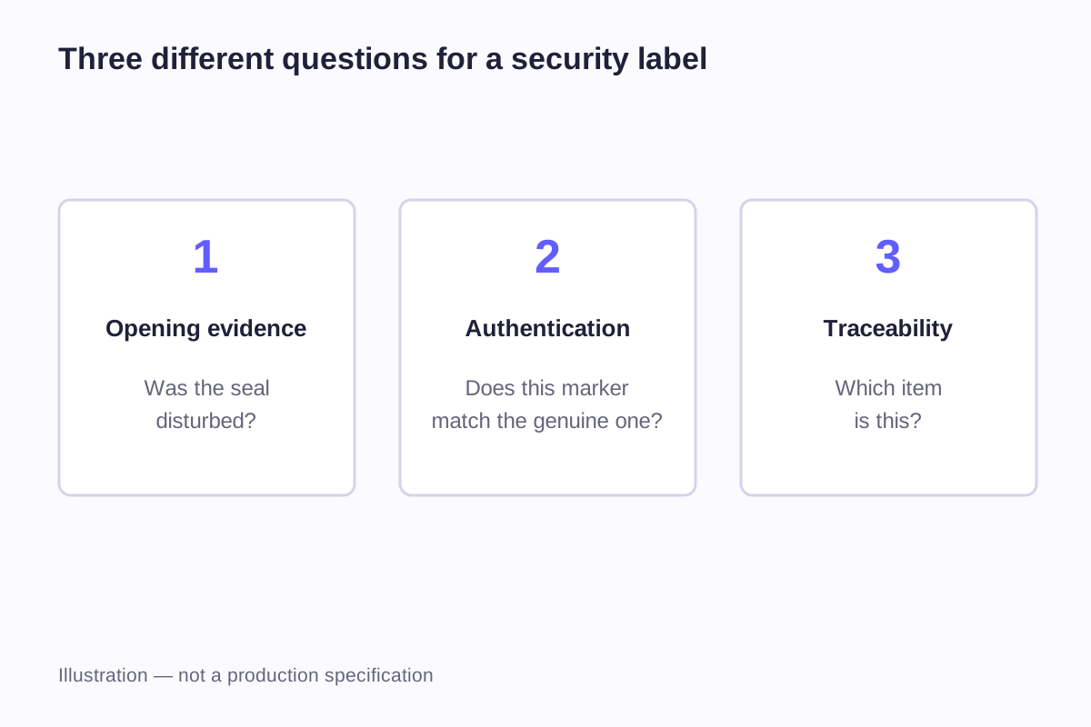
A tamper-evident label is intended to show a change associated with opening or removal. A holographic label describes an optical appearance or feature. Those properties can exist together, but one does not automatically provide the other. A colorful reflective sticker may remain intact when a package opens, while a plain-looking seal may be designed to reveal opening.
Begin with the question the label must answer: has the closure been disturbed, does the marking have an expected authenticity feature, or can an individual item be connected to records? That choice determines the evidence you need from the label and how it should be positioned on the product.
Match the question to the label's function
“Security label” is a broad description. It becomes useful only when the intended function is clear enough to assess.
| Question | Relevant function | What the user needs to observe or retrieve |
|---|---|---|
| Has this closure been opened? | Tamper evidence | An agreed visible change associated with opening or removal |
| Does this marking match the expected original? | Authentication | A defined feature and a reliable way to assess it |
| Which individual item is this? | Identification | An identifier with a defined meaning |
| What happened to this item? | Traceability | Records connected to that identifier |
| Does the packaging need a reflective brand effect? | Decoration | The intended appearance under normal viewing conditions |
A design may serve several of these purposes. For example, an identifier could appear on a seal that also changes when opened. The order still needs separate requirements for the visible change, the identifier and the records behind it.
Different users need different information from the label. A customer opening a box needs to recognize signs of opening. A warehouse team may need a readable code. A brand-protection team may follow a defined authentication procedure. When one label serves several users, give each of them a clear place to look.
Tamper evidence is a response, not a decorative style
Several material constructions can be used to create an opening or removal indication. Some reveal a message; others are intended to break or show a visible disruption. The required response should be described in words rather than inferred from a shiny finish or a product name.
A VOID message is one example. Its visibility and location depend on the particular construction and application. The buyer needs to know what should appear on the label, what should remain on the receiving surface, and how the result will be assessed after the intended opening action.
Security cuts or perforations are another approach. HERMA's 58361 sealing-label description combines adhesive performance with security punches and a central perforation intended to be destroyed during opening. This is a named product construction, not a property of every transparent label. Source: HERMA 58361 product information.
Compare the label before and after opening. Damage from normal packing or handling can be mistaken for a tamper indication, so the unopened sample matters too. Then open the package in the intended way and record what changes.
A decorative hologram and an authentication feature have different jobs
A decorative holographic material can produce changing reflections as the viewing angle changes. That appearance may be the whole reason for choosing it. An authentication feature needs a defined behavior or characteristic that can be compared with the expected original.
KURZ SCRIBOS describes TRUSTSEAL as a system of optical security features for visual authenticity checks, with optional digital functions. Its examples include effects that respond to changes in viewing angle and light. That illustrates the difference between specifying a particular authentication feature and simply requesting a rainbow surface. Source: KURZ SCRIBOS holographic security information.
For a visual check, the user needs to know which feature to inspect and what to expect. “Look for something shiny” does not identify a specific original. The design, viewing instructions and approved reference need to work together.
If the goal is only packaging appearance, the holographic and foil comparison is the more relevant starting point. Custom holographic and foil stickers can be discussed as decorative branding without attaching an unverified security claim to them.
Position a seal across the opening it is meant to indicate
A label can be made from an appropriate material yet sit in an ineffective position. A seal placed entirely on one stationary panel may identify that panel without interacting with the closure.
Draw the closed package, show which parts move during opening, and place the proposed label outline across those parts. Include folds, gaps, coated areas and any printed region that must remain visible.
A 50 × 20 mm layout example
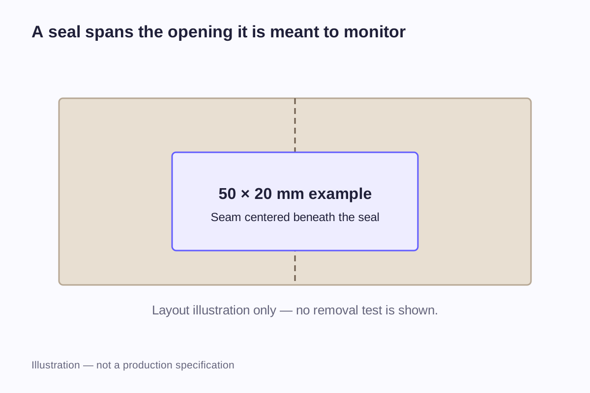
Consider a 50 × 20 mm rectangular label crossing a straight 2 mm gap between two coplanar package surfaces. If the 50 mm length crosses the gap and is centered on it, the nominal length remaining on each side is:
(50 − 2) ÷ 2 = 24 mm per side
At the full 20 mm width, each side has a geometric contact area of 24 × 20 = 480 mm². The two sides total 960 mm², assuming complete contact and no other interruptions.
These calculations describe the drawing. They do not establish a minimum bond area or predict a tamper response. A fold around a corner, surface texture or a different gap changes the contact geometry, and the selected material must be assessed on the actual package.
| Dimension or position | Example value | What it helps describe |
|---|---|---|
| Overall label | 50 × 20 mm | Space required by the complete design |
| Gap crossed in the flat example | 2 mm | Area without the assumed package contact |
| Length on each side | 24 mm | Nominal coverage of each package part |
| Centerline | Aligned with the gap | Intended placement reference |
| Viewing area for the indication | Shown separately in artwork | Where the user will inspect the result |
For a lid that folds around a corner, draw the path across the two faces instead of reusing a flat-gap illustration. Record the position from the edge or crease so the same placement can be reproduced during packing.
The sticker size guide explains how to dimension an outside outline. For a seal, add the opening path and the intended observation area to that basic drawing.
What a VOID label data sheet tells you
3M's 7380 data sheet describes a polyester stock with a VOID indication and gives the following typical dimensions. It notes that the compact message allows small labels of approximately 13 × 32 mm. Source: 3M 7380 technical data sheet.
| Item in the 7380 data sheet | Published value |
|---|---|
| Small-label example | Approximately 13 × 32 mm |
| Face-stock thickness | 0.058 mm |
| Adhesive thickness | 0.025 mm |
The sheet also cautions against hiding the message with opaque printing and calls for assessment on the actual application surface. These figures and behaviors belong to that material. They are not a general minimum security-label size or a WiseSticker stock specification.
Thickness figures answer a different question from the label's outside dimensions. Face stock, adhesive and liner are separate layers; the liner is removed during application. The sticker materials guide shows how to read those layers without confusing total supplied thickness with what remains on the item.
Keep the material name and data-sheet revision with the sample record. When comparing a report, match its grade, adhesive and receiving surface to the proposed label. A shared description such as “polyester” or “security label” is not enough to establish that match.
Give the indication room in the artwork
A seal often carries a logo, opening instruction and identifier in addition to its security function. Those elements compete for space. A large opaque logo can occupy the area the user is supposed to inspect, while a fold can pass through small wording.
Build the layout around the intended reading sequence. The user may first see a short instruction, then the area to inspect, then an identifier used when contacting the supplier. Giving each a distinct location can be more helpful than shrinking everything into a dense block.
A working drawing should show where the visible indication is expected, not just where the brand artwork prints. If the construction has a repeating pattern, assess the actual cut size and position with that pattern rather than assuming the same message will be visible in every possible outline.
The appearance before opening also matters. A reflective background, fine text and a busy logo can make the intact label difficult to read. Compare the design in the lighting where it will be inspected, using the final size rather than only an enlarged screen preview.
An identifier needs records to become useful for traceability
A printed number can distinguish one label from another if it is assigned that way. It does not, on its own, record where the labeled item has been. A QR code can carry data or a link, but the presence of the symbol does not establish an authentication service behind it.
GS1's explanation of EPCIS describes traceability information as events concerning an object: what was involved, when and where an event happened, and its business context. The important point for a label buyer is that records must exist beyond the printed identifier. Source: GS1's EPCIS explanation.
Agree who assigns the identifiers, how each is linked to an item, where the records are kept, and what a user sees after a scan or lookup. These decisions need to be made alongside the label artwork.
Separate the printing responsibility from the verification responsibility in the project brief. If a third party operates the records or authentication service, its requirements need to reach the label designer before the layout is finalized. A readable printed code and a working verification process should be assessed separately.
Evaluate the finished label on the actual package
Before ordering a sample, describe what should happen when the package is opened. Include the package type, label position, opening action and visible change. “Looks secure” does not tell the supplier what result you need.
| Record | Information to capture |
|---|---|
| Sample identity | Label design version and proposed material |
| Receiving surface | Package material, coating, finish and relevant condition |
| Placement | Photograph and dimensions relative to the opening |
| Application conditions | Method and any material-specific instructions followed |
| Time before evaluation | Actual elapsed time, with the reason for that interval |
| Intact condition | Appearance after normal handling before opening |
| Opening observation | What changed and where it was visible |
| Reading result | Whether the intended wording or identifier remained usable |
Use the same method when comparing samples. If the package, waiting time or opening position changes, record that change so the results can be compared fairly. Leave untested conditions marked as untested.
A material demonstration and a finished product assessment are not the same exercise. Artwork coverage, cutting and placement can change what the user sees. Photos should therefore include the actual printed sample and relevant package surfaces, not only an unused piece of material.
For an industrial or security label project, tell us what the label should do, where it will be applied and any testing standard the project requires. WiseSticker can discuss specialty materials, supporting documents and project-specific third-party testing. If you need a VOID message, a destructible seal, individual numbering or a verification service, ask about availability for that project; these are not included automatically.
Frequently asked questions
No. A decorative optical effect is not itself a defined authentication process. The user needs a feature to assess and a reliable reference or verification method. A security system may use holographic features, but the word “holographic” alone does not specify that system.
The observed result depends on the selected construction and application. The material specification should explain where an indication is intended to appear. Assess the finished label on the actual surface instead of assuming that all products described as VOID labels leave the same kind of mark.
It may be possible, but those elements need enough room to be read and must not interfere with the intended indication. Start with the required function and available placement area. Enlarging the label or reducing nonessential artwork can be more useful than shrinking every element.
No. A number can serve as an identifier, while traceability requires records associated with the identified item or group. Decide who maintains those records and what information users can retrieve. Printing a sequence does not automatically create that supporting process.
It should not be assumed to do so. A change in coating, texture, geometry or label position can create a different application. Identify the package versions covered by an assessment and address material or placement changes when the range is expanded.
Related guides
- Holographic vs Foil Stickers: Effects, Materials and Artwork
- Sticker Size Guide: Dimensions in Inches and Millimeters
- Sticker Materials Explained: Vinyl, PET and Paper
Send the package or item details, the label position and the result you need to observe. Include any material, testing or identification requirements so the proposed construction can be assessed for that task.
Discuss a Security Label Project